
Transcript#
This transcript was generated automatically and may contain errors.
Hi, I'm Hossein. I'm a software engineer and team lead working on notebooks in Positron.
Today I'm going back to my roots as a data scientist. So our product manager, Cindy, came to me with a request. Our users are really active on our GitHub repo, and we'd like to be able to tap into that and be able to get a sense of what they're interested in over time. But this isn't easy to do in the GitHub UI today. So over the next few minutes, we'll create our own dashboard to provide this for you using Jupyter Notebooks in Positron. Along the way, I'll share a few tips and tricks that you can bring into your own day-to-day work. Let's go.
Setting up the project
Okay, so I'm in the welcome screen of the Positron IDE. The first step is to make a new folder for our project. And it's a Jupyter Notebook project. I'll call it mentions-dashboard. And it is a Git repo. And we'll use UV to manage this environment and use Python 3.13.
Let's create in the current window. I'll save the notebook as mentions-dashboard. And the next step is to make sure that we select the correct kernel for the notebook. There's our environment. So I know which dependencies I'll be using this project. So let's install those. First, initialize the folder, and then use UV to install our dependencies. So we've got polars, pyarrow, pins, plot9, .inv, and requests. And close the terminal again. It's always a good idea to restart the kernel after installing dependencies.
Using Assistant to download GitHub issues
I'll use Assistant to help us with this. So we'll ask it to use the GitHub API to download issues from the Positron repo for this year, and also to use my GitHub token from the environment so we don't hit thread limits. So Assistant has access to the notebook. It can read cells, edit cells, and execute them, and also see your execution history. It will ask for permission before it does these actions, and I'll allow it for the entire session. And so it looks like it's got the token and setting up authorization, and then requesting the issues in point and converting that to a data frame.
So let's allow the executions as well. This might take a few minutes to run, so let's just fast forward through that. Okay, it hit an error. Thankfully, Assistant can see errors, and so it suggested a fix already, which was to change the time zone string format, and it's trying again.
Okay, it's got the results, so 1,084 issues in a data frame. And as you can see, I can explore this inline, both our inline data explorer widgets. I can actually scroll through the entire notebook, and it will lazily and efficiently load what I'm looking at. And it looks like we don't have the body of the issues, so let's try and figure out why.
Debugging with the notebook debugger
So I'm going to use the debugger to see what one of these responses look like, whether that has the body of the issue, and if we can then add it to the data frame. So I add a breakpoint. Actually, let's put it a bit lower, and let's debug that. Cool, so we stopped at the breakpoint. We have a batch of issues. I can browse through it like this, or it might be easier to check immediately. Okay, so there is a body. It's just not being added to the data frame, so let's add that in as well.
Okay, so now we have the body as well.
Exploring data with the data explorer
So we could quickly tell from the summary that a column was missing, but we can also open the full data explorer to get a better idea of our data. So the first thing that stands out to me here is that 48% of values of this column are missing, but I think that makes sense for closed at date. It probably means that issues that aren't closed yet don't have this value set, but we can double check that by filtering down to only where this is missing, and we can then check the state and see that all of the issues that don't have a closed at date are open, so that's fine.
Plotting weekly mentions
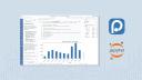
Okay, now for the final step. We'll ask Assistant again to plot the number of mentions of the Jupyter in this year, which is the full data set, and let's actually make that weekly mentions, number of weekly mentions. Okay, it's first going to check the data before writing the plot, and it's going to filter to 2026 and search for Jupyter in the title on the body, which makes sense in group by created date. Okay, we have a plot. I actually wanted a line plot, so let's ask it to make it a line plot, and it's using ggplot as well, and there's a nice title, and it's looking good.
Awesome, so we have our line plot of the number of weekly mentions of Jupyter in Positron issues this year. One final step I like to take is to use one of the built-in Assistant actions, improve this notebook, so this is nice after I've been kind of exploring something and going really deep into the flow and not really cleaning things up after myself, and so this action Assistant will add in sections and clean things up and remove invalid imports and things like that, so I like to run this at the end.
Okay, so it says it added a header cell, a few sections, three factors, and so on. So, I'll do another pass over this myself and make sure that everything is good to go before I share it with my colleagues.
Recap of part one
Okay, great. Let's recap what we did so far. First, we set up a new Python Jupyter notebook folder for our project. We then downloaded issue data for the repo with help from Assistant, we ran into an error, and we debugged it with the notebook debugger. We then investigated the data with the data explorer, and finally, we plotted the weekly mentions of a specific keyword in the repo as requested. So, it's all done, cleaned up, and the notebook is ready to share with Cindy. We'll take over from here.
Cindy's walkthrough: exploring the notebook
Hey there. My name is Cindy Tong, and I am a product manager on Positron. Now that Wasim has done his investigation in a Jupyter notebook, I'm going to pull down his changes and I'm going to poke around to understand a little bit more what type of analysis he's done. I will then use Assistant to help me then turn this notebook into an interactive dashboard that we will publish together onto Connect so that we can share it out with more of our colleagues. Let's jump into it.
Okay. So, here I've opened up my colleague's notebook, and the first thing that I'm going to do now that I have it opened inside of the Positron notebook editor is I'm going to run all the cells just to help me orient myself. I can see on the right-hand side that the variables pane has updated and that I can see the data frames that are within this notebook. It looks like there are two data frames. There are some values for the variables that are included in here, including a Connect API key, which I've set up, as well as a Connect URL. There are some functions listed, as well as some classes. So, the first thing I can do to help me orient myself is I could actually go over here and use an AI quick action and click on this explain this notebook prompt.
Click on this. It's then going to run an ask mode, the same way that I did in the run and ask mode, the saved query that will give me a summary of what is included in this notebook. So, let's let it load the response, and I'm going to open this up a little bit more on the side here so we can see the whole response. So, it looks like it's giving me an overall purpose for the notebook. It looks like we are pulling GitHub issues from the Positron repository. It gives me a rundown of what's happening in here, including setting up. It looks like there's an empty cell here that I can clean up. It's loading data, and then there's some visualization. It looks like they're mentioning that we are connecting to a pin, which is where we're reading the data from. I like that it's calling out some of the packages that are included here, some information around how the data is being parsed, as well as what we're using for visualizing it, and then there's a highlight here of some key assumptions and prerequisites for running this notebook. I've already gone ahead and set a connect API key in a .env file so I don't have an error, and it is reading from a pin that I have here.
Okay, great. Let's fact check this and actually run through this notebook ourselves. So, taking a quick look around, we're doing some imports. There is this URL that we've mentioned just now. Oh, and we found this empty cell here, so I'm going to go ahead and delete this. I can here see the pin, as well as a preview of the data frame, the raw data frame that looks like it has around 3,705 rows, and each of these rows represent a GitHub issue with a couple of columns and information for each of them.
Okay, now that I've opened up my data in the Data Explorer, I can see a couple of key summary stats here. I see my columns. There's some histograms that kind of show the distribution of the values for each of these columns. There are some highlights of columns, like closed up, that are missing some values. Down here, I can see that there are a total of 3,705 rows and 10 columns. So, a question that I may have as the PM of the Positron team is, I may want to know how many of the issues are related to the notebook notebooks. So, I will click body, and let's say contains notebook as a starting search.
Interesting. So, it's showing me that about 25% of the issues that we're getting are related to notebook, and what if I wanted to drill down a little bit more around total reactions to each of these issues to get a signal of which ones do our users care the most about. I can see here that there's a max of 109 with a mean of 0.38. So, generally, most of them have no reactions at all. So, let me add another filter here, and let's just say total reactions are greater than or equal to one. Okay, we've drilled this down now to about 143 rows, and if we wanted to, we could even update this a little bit more if I wanted to see like maybe the top top ones. Let's add a filter of five. Interesting. Okay, and so that we can see this a little bit better, let's pin this column and pull up the total. Let me make this a little bit smaller. The total reactions column, and I have it sorting right now and descending. Perfect. That's great. Kind of a good view to see and what's validating to also know here is that we are working on making some progress for each of these issues here.
Converting the notebook to an interactive dashboard
Let's go back into the notebook now. So, in our next cell, we can see that there is a plot, and it looks like we are hard coding a query for Jupyter, and we have a visualization here that looks like it shows me past rough like two and a half years the number of mentions of Jupyter within the issues that we have. So, thinking through this, I think something that would be really helpful for me to have is a dashboard where I'm not hard coding the Jupyter term, but I can type in different terms and compare the mentions across the these different terms over time. So, let's actually try to use system to help us turn this into an interactive dashboard that I can share with my colleagues.
I'm going to jump back over into chat mode, and we're going to change this to agent, and I'm going to ask the assistant to help me make a new interactive dashboard that shows the mentions visualization in the current notebook. Allow me to, let's say, search for different terms, select a start and end date, and let's say select up to three different terms to compare over time. I show both the plot and the list of matching issues. Fill this in a new app. Okay, that was long. Hopefully, I didn't make any typos there.
While it's loading, just to help us orient ourselves in terms of some of the settings that I have here, I am currently using Claude's Sonnet model. I have chosen Anthropic as my provider. Apositron does allow you to bring your own provider, so you can select a different provider here. I personally have found that the responses I get through the Anthropic models, whether that be through AWS or directly through Anthropic, I've seen a much better response, so I'm going to keep it here. The other thing to call out here is that if I wanted to tweak this further, there are different tool calls that I could disable or enable. Right now, I have them all checked. As a system is working, it has created a to-do list here that I can expand to look through the different stages that it's going to be working through. Looks like it has one more to do right now, and it's trying to verify that the app it's created is running correctly. It stopped because I haven't allowed it. I can click to allow this command in its workspace. I'm going to go ahead and do that.
And it's giving me an overview of what it's done. So let's just scroll up a little bit. It's giving me some instructions. I'm going to skip reading this, and I'd like to one-shot. Let's see if we can just run this app without any errors. So I've clicked play, and on my right-hand side, I do have the viewer. Let's expand this so we can see this a little bit better. Wow, I'm pretty impressed that it generally looks pretty good.
So it looks like I have a mentions dashboard here. Search term over time. I have Jupyter defaulted. What if I also wanted to look at Notebook? It's added a second line, and let's also look at Quarto. Oh, it's added a third line as well. And we change the start and end dates to just look at the past, maybe since the beginning of 2025. Great. And is it actually showing me the list of issues? It looks like it's created a second tab here. Ooh, okay. Got an unexpected keyword argument. Column labels. Let's actually pull this here and ask Assistant if it can help me fix this issue. I'll fix the current issue on the matching tab. I'm going to share that there with the Assistant. Let me expand this. Name the columns and the data frame before passing it. Okay, it looks like it's made some updates to my Python file. It's even re-rendered my file. And let's reopen this to see if we still see that issue. And ta-da! Awesome. Okay, so in a pretty short period, we were able to create this interactive app. Now it has a list of issues. I'm able to search across these different search terms. As a next step, I like to deploy this onto Connect so that I can share this with my colleagues.
Wow, I'm pretty impressed that it generally looks pretty good.
Deploying to Connect
So here, let's go back here. And let's make sure that I accept all the changes. Save my file. Great. Just want to double check it's still working. I will now click on the Publisher extension. We'll include some instructions on how to get this set up via either Connect or PositConnect Cloud. But what I've done here is I'm going to click on Create a New Deployment. I'll select my entry file, which is this app.pi. It's the file I want to deploy. I'm going to just name it this name right now. That's fine for me. Select this. I've configured my API keys here. You can create a new one if you'd like through creating a new credential, and then you'll have two options of how you'd like to do this. If you are looking for a free option for yourself, PositConnect Cloud is great. If you're looking for something for your team, PositConnect would be the better option here. So I'm going to choose this option that I've already pre-configured via my Connect API key. I will select that. I'm just going to double check which files I have installed here. I can also double check which Python patches here are listed. And in case I missed anything, I'm just going to click this Refresh. OK. I think things are looking pretty good to me. So I'm now going to click Deploy Your Project.
And I can see in real time the stages that Publisher is taking to deploy my project to Connect. Awesome. That wasn't too bad. It looks like I have a successful deployment. So we're going to now click on this link and check out my deployment.
OK. So I've gone ahead. I've opened up that URL that was shared with me in Positron. And I can see now that my Shiny application has been deployed to Connect. Let's test out just to check if this is still working. Awesome. And great. All I have to now do is update permissions here so that I can share these with my colleagues. In Connect, there's a whole bunch of functionality that you can do. We'll share some documentation on the capabilities. But here I can decide if I want to share this with specific people on my team or make it available to everyone. There's specific integrations that I can add on to this, such as including a GitHub integration. There's also a way for me to customize this URL or even unlock or lock this file. Some other highlights here to mention are you can add in environment variables if you'd like, as well as checking your runtime that you have set up, and tags if you'd like to help tag and organize your different files.
Extra credit: scheduled notebooks and pins
Some extracurricular items that you can do that we haven't been able to do together is you can also deploy a Quarto doc, so a Quarto notebook. I'm going to go into my GitHub issue daily refresh notebook that I've created. Currently, I have this scheduled on a daily schedule right here to run once a day. I built this so that instead of getting rate limited by the GitHub API, I can just query it once a day. It's actually writing the issues in a specific format into this pin that I've set up. This will run once a day, and I have this configured to write into my pin. Let's take a look at the pin. Right here, I have the pin that it's being written into, and this is what the original Jupyter Notebook is querying from. Here you can see that I have some temporary data that I want to store and write into on a daily basis. It has notebooks for me. It's a good option to have if you're not looking for a full... This is not a full database replacement, but a place where we can have access to data within Connect and to query from it.
Final recap
Okay, great. Let's just wrap up now what we did today. Okay, so we did a lot together today, and as a recap, we were able to open our colleagues' Jupyter Notebook. We ran it. We then used the assistant AI actions to help us summarize and orient ourselves in terms of what the content of the notebook had. We used the variables pane to watch our variables get updated in real time, and we also used the data explorer and embedded data frame to filter the GitHub issues and to sort them. Then we used assistant to convert our Jupyter Notebook into an interactive Shiny app without actually writing any code. We were able to debug some issues also using assistant, and then for our last step, we were then able to deploy our Shiny app via the Connect publisher to Connect. And with that, we can now share it out with our colleagues and have like an interactive dashboard that I can query different GitHub issues.
Then we used assistant to convert our Jupyter Notebook into an interactive Shiny app without actually writing any code.
I also pointed out some extra credit items that we can explore in your own time around being able to have a notebook that runs on a daily schedule, that queries a GitHub API, and writes it into a Connect pin, and then having the dashboards that we've built out today read from that Connect pin. Thank you for attending this session today, and we're going to wrap up. We're really excited to talk to you more in our Q&A.


